Accesibilidad web
What Is Web Accessibility, and How Many Prospects Are You Leaving Out?
Equipo Artisma
Agencia de Marketing B2B
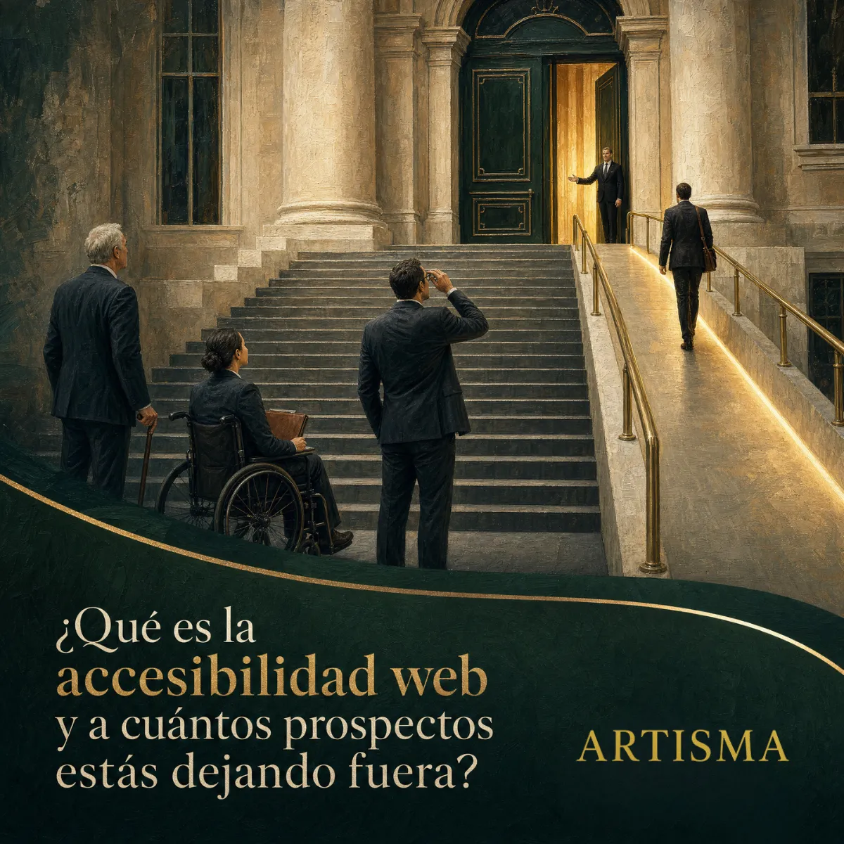
The purchasing manager at a food plant had to choose a packaging equipment supplier before the end of the month. He opened the website of the company he had been recommended on his phone, in a hallway of the plant, and found a catalog with light gray text on a white background, buttons the size of a fingernail and spec sheets turned into images he could neither enlarge nor read.
He has worn glasses for years, and a phone screen under industrial lighting did not help. He tried to enlarge the text, but the website blocked zooming. He tried to fill out the quote form, and the phone field rejected his number without explaining why. On the third attempt he closed the tab and opened the website of the second supplier on his list.
The company that lost the quote never found out. Its reports showed just one more mobile visit that lasted a minute and left without any contact details.
Web accessibility is the practice of designing a website that anyone can use. It applies with or without a disability and on any device, and a website with poor accessibility shuts out buyers who never show up in your reports.
The prospects your website shuts out leave without complaining
Web accessibility brings together the practices that let anyone perceive, understand and operate a page, whether or not they see well, whether or not they can hear, whether they use a mouse or browse from a phone in direct sunlight. It began as a way to serve people with disabilities and ended up improving the experience for everyone, because the same barriers that stop someone with low vision also stop a buyer in a hurry, with scratched glasses or on a slow connection.
Part of the population lives with some limitation, and your buyers are among them
Population statistics in Mexico show that a considerable share of adults live with a disability or a limitation in seeing, hearing, moving or concentrating, and that share grows with age. Decision makers at a company are often over forty, wear glasses and read on their phones between meetings. If your website demands sharp eyesight, a steady hand and a large screen, it rules out some of the people who sign the purchase orders.
Why barriers do not show up in your analytics
A buyer who cannot read your product sheet does not fill out a complaint form. They close the tab and open the next one. In your report, that visit is logged as one more bounce, mixed in with the visits that did find what they needed. That is why accessibility resembles maintenance: the problem is hard to see until someone measures it on purpose.
The most common barriers on the websites of companies that sell to other companies
We review industrial websites every week and the same barriers keep coming up. These are the ones that cost the most prospects.
Low-contrast text and sizes that cannot be enlarged
Light gray on white looks elegant on the designer's calibrated screen and disappears on a phone under plant lighting. The international accessibility guidelines set a minimum contrast between text and background, and most corporate websites fall short of it in footers, form labels and secondary text. Blocking the browser's zoom makes the problem worse, because it takes away the visitor's last tool.
Images without alternative text and spec sheets turned into images
Alternative text describes an image for whoever cannot see it, whether that is a person using a screen reader or a search engine indexing your catalog. A specification table saved as an image is invisible to both: nobody can copy a value, search for it or read it with a screen reader. That table is exactly the content an engineer needs before requesting a quote.
Forms that reject information without explaining why
An accessible form has visible labels on every field, accepts reasonable phone and email formats, and when something fails, it says which field to fix and how. A field that turns red with no message, or an error message that only changes color, leaves the visitor guessing. Every failed attempt lowers the odds that they will try again.
Navigation that only works with a mouse and buttons too small to tap
Menus that open on hover do not work on a touchscreen, and buttons that are too small or too close together cause mistaken taps. People who navigate with a keyboard, because of a motor limitation or out of habit, need every link and button to be reachable with the Tab key, with a visible indicator of which one is selected.
Videos without captions and downloads a screen reader cannot open
A plant video without captions loses whoever watches it with the sound off in a shared office and whoever cannot hear. A PDF scanned as an image cannot be read with a screen reader or searched by keyword. Both are expensive pieces of content that end up failing to do their job for part of the audience.
What your company gains when its website becomes accessible
Accessibility is often presented as a compliance issue, and some markets already have legal obligations for certain sectors. For a B2B company, the strongest argument is commercial.
More prospects complete the form, because the fields are clear and errors get fixed on the first try.
The website works better on mobile, on the plant floor and on slow connections, which is where many industrial buyers look it up.
Search engines read the content better: well-ordered headings, alternative text and spec sheets in real text all support your rankings.
Tenders from large companies and government agencies increasingly include accessibility requirements for suppliers and their platforms.
The brand comes across as careful. A buyer who can use your website effortlessly assumes your product is just as well thought out.
Those benefits come without a full redesign: most of them result from adjustments to contrast, structure and forms on the website you already have.
How to measure your website's accessibility today and where to start
The international reference is the Web Content Accessibility Guidelines, known as WCAG, which define conformance levels and testable criteria. For a corporate website, the intermediate level is a reasonable goal.
Before using any tool, run three tests on your own website. Navigate the whole site with the Tab key and confirm that you can reach every link, menu and button, and that you can always see where you are. Open it on your phone, out in the sun, and check whether you can read the secondary text and fill out the form with one hand. Then ask someone on your team to fill out the quote form with a deliberate mistake, to see whether the website explains what to fix.
After that, an accessibility audit combines automated tools, which detect contrast, labels and structure, with a manual review of the flows that matter: finding a product, reading its spec sheet and requesting a quote. The result is a list of adjustments ranked by impact, which a team can apply to the current website within weeks.
At Artisma, every website we design meets the accessibility guidelines from the first sketch: verified contrast, scalable typography, forms with labels and clear messages, keyboard navigation and spec sheets in real text. If your website already exists, we audit it and hand you the list of adjustments ranked by impact, so you stop losing the buyers who close the tab today without a word.
Frequently Asked Questions
Is web accessibility mandatory for a private company in Mexico?
For most private companies there is no general legal obligation yet, although there are guidelines for government websites and growing requirements in tenders and in contracts with companies from other countries. Beyond any obligation, an accessible website converts better and ranks better, so it makes sense to treat it as a business decision and get ahead of any future requirement.
Does making my website accessible mean changing its design or making it less attractive?
Most adjustments are invisible to anyone who does not need them: heading structure, alternative text, form labels and keyboard navigation order. The visible changes, such as raising text contrast or enlarging buttons on mobile, make reading easier for everyone. An accessible website can be as attractive as any other, and more people can use it.
How long does it take to fix the accessibility of a website that is already live?
It depends on the size of the website and how it was built. Contrast, label and alternative text adjustments can be applied in days on a website with well-made templates. Spec sheets saved as images and scanned documents take longer, because they have to be converted to real text. A prior audit ranks the adjustments by impact, and the first results in forms and on mobile usually show within the first few weeks.
If you want to know how many buyers close your website today without a word, start by measuring its accessibility. Schedule a free 15-minute call and we will review with you the barriers your website puts in front of people who already want a quote.